Your way to
higher education
Brand identity for Compass
Compass is an initiative of the University of Sydney that empowers students from traditionally underrepresented backgrounds to access higher education. In order to be able to connect both with the children and their parents, compass needed to evolve its brand identity into a rich new territory.


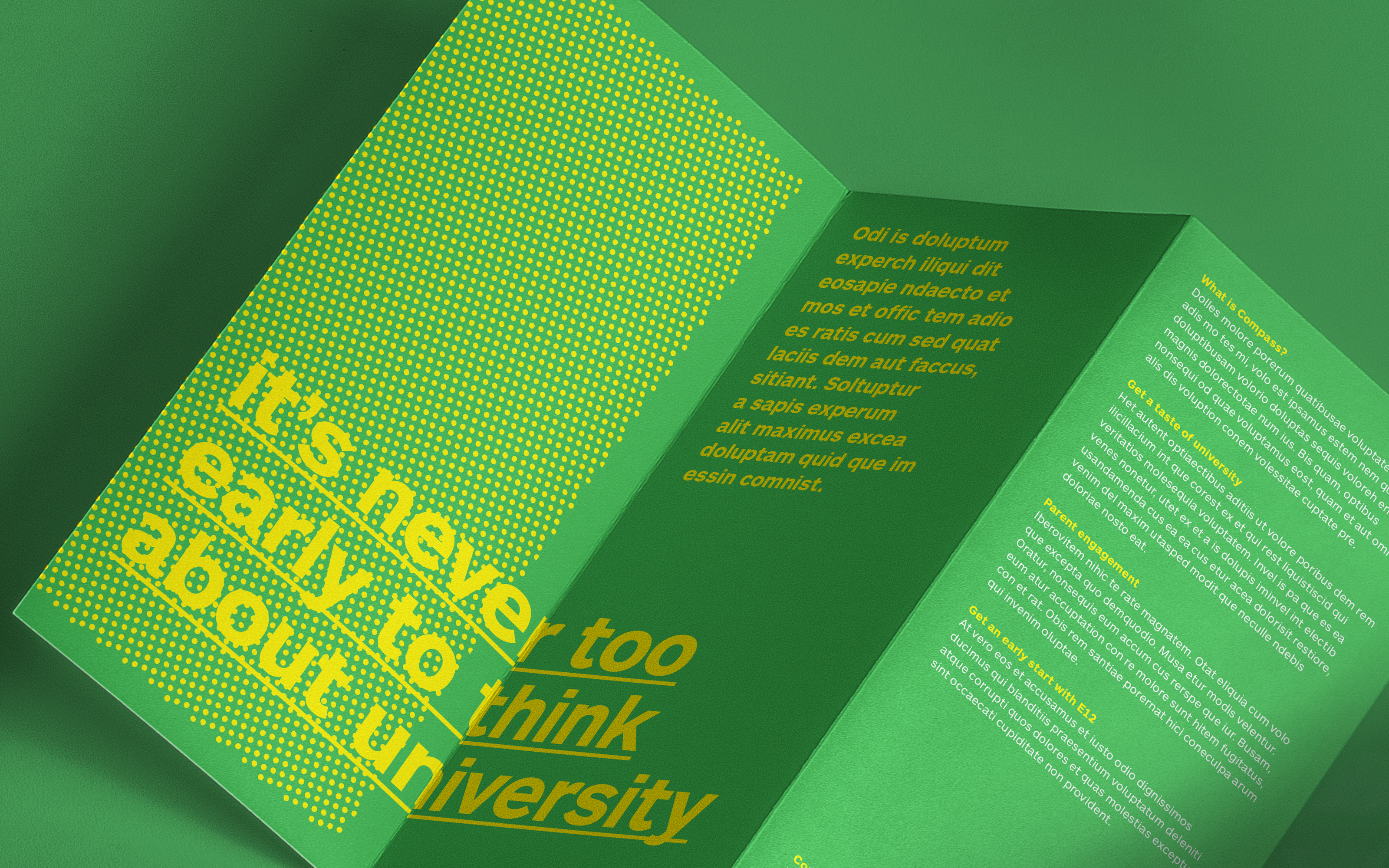


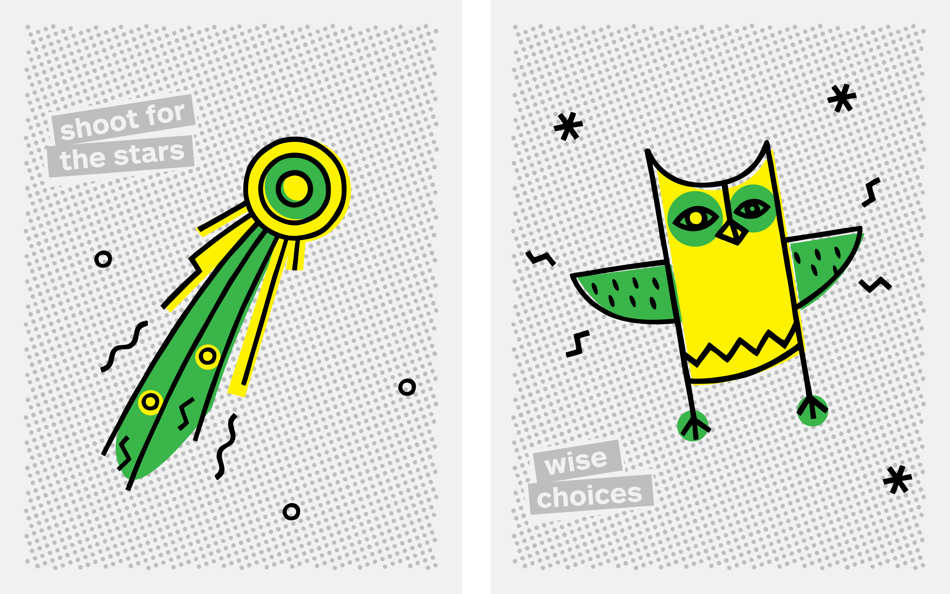
Vibrant colours meet energetic illustrations and language full of individuality, meaning and appeal.
The system consists of modular parts and allows Compass to adjust to the age group they are talking to, while maintaining a strong brand recognition.
The system consists of modular parts and allows Compass to adjust to the age group they are talking to, while maintaining a strong brand recognition.
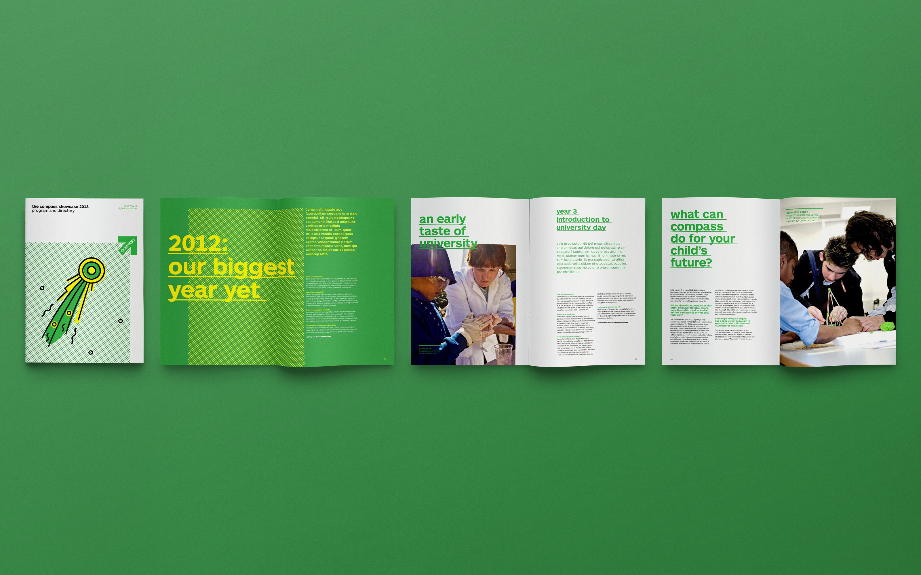
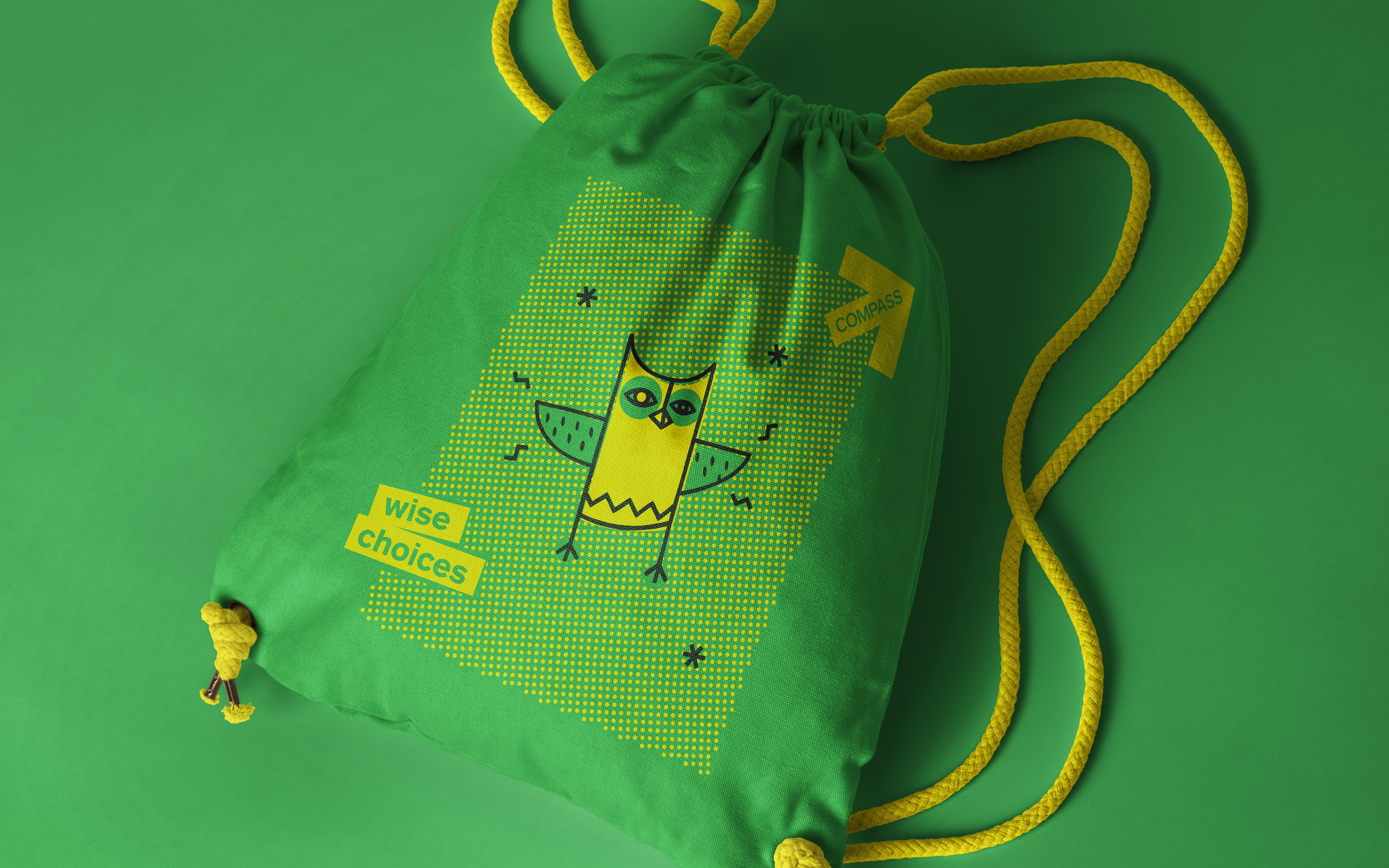

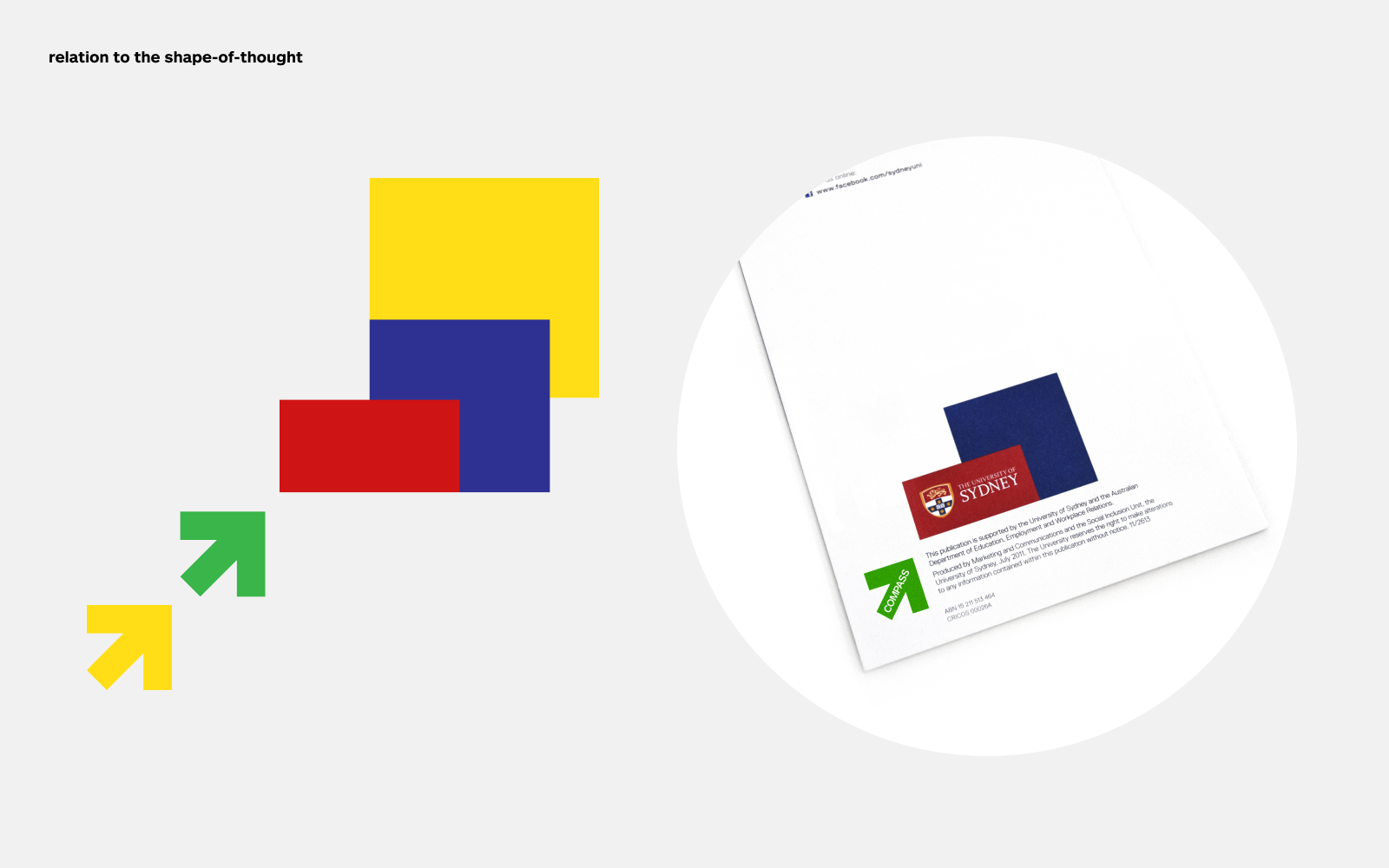
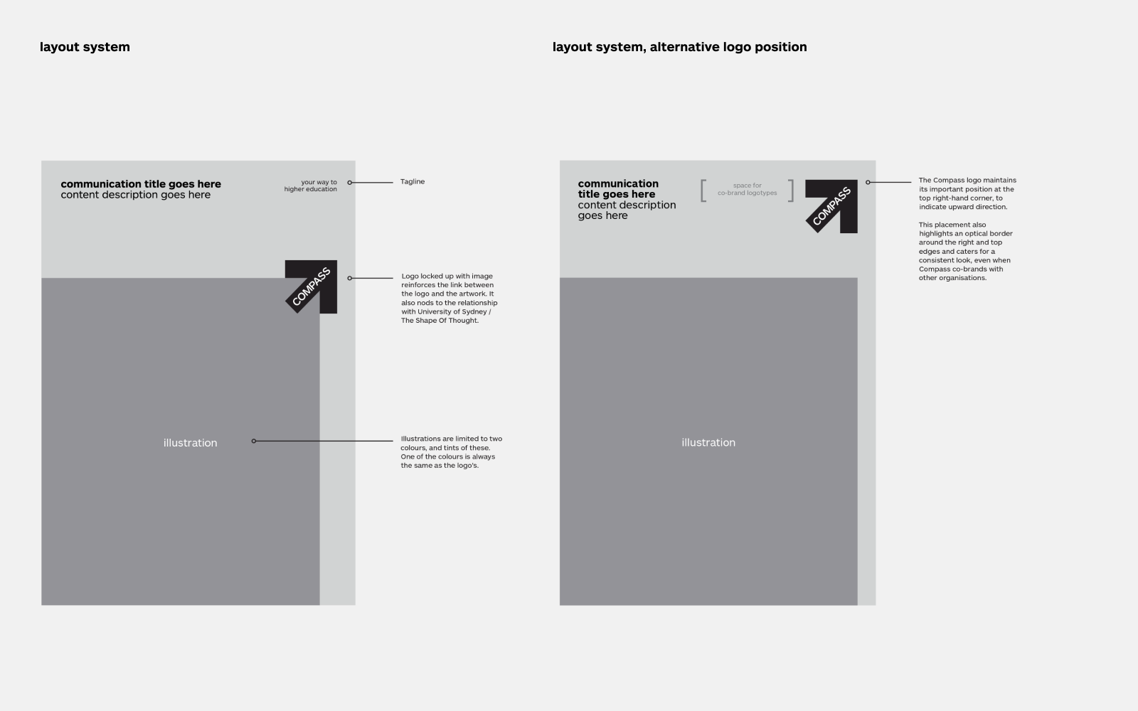
The simple and iconic forward-focussed arrow becomes the symbol for a natural progression from school to university. It’s a playful nod at the University of Sydney as it borrows elements from its design system Shape of Thought.
Project credits
Created at Moon, 2013
Creative Director – Linda Jukic
Designer – Niklas Alvarsson
Illustrations – Niklas Alvarsson, Freja Hedvall

